 AIREITER
If Seedream 5 Pro keeps giving you a beautiful image with the wrong headline, drifting faces, or a crowded layout, adding more adjectives is usually the wrong fix. The better approach is to treat the prompt as a design brief: define the image’s job, assign each reference a role, and separate the parts that must stay fixed from the parts that may change. Chinese can be useful for the brief, but exact on-image copy and layout instructions still need tighter handling.
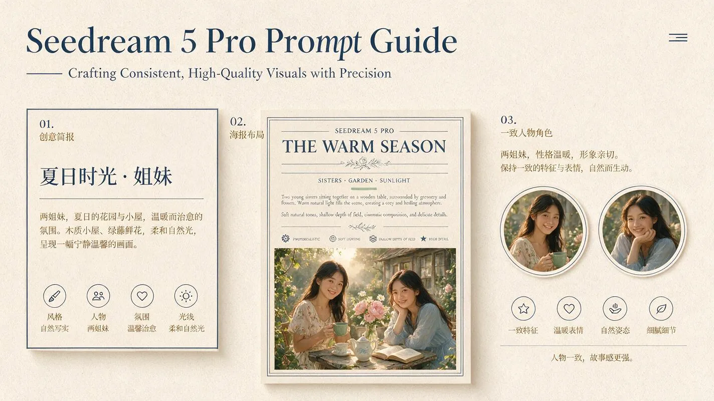
What makes a Pro prompt different from a Lite prompt?
Seedream 5.0 Pro is positioned by ByteDance Seed as a multimodal image model for dense information layouts, interactive editing, realistic textures, and multilingual generation. The official launch post says it supports more than ten commonly used languages and highlights layer separation, reference fusion, and text-rich designs (ByteDance Seed).
That does not make every prompt automatically better. Pro is worth prompting differently when the image has relationships to preserve: a poster hierarchy, a product label, a reference person, or several subjects sharing one scene. For faster visual exploration, the site’s Seedream 5.0 Lite prompting guide remains the relevant companion. This guide focuses on Pro’s control problems.
A useful distinction is:
| Task | Prompt priority | Start with |
|---|---|---|
| Loose concept exploration | Subject and mood | Short natural-language brief |
| Product or portrait image | Identity, material, camera, light | Reference plus preservation rules |
| Poster or infographic | Reading order, text, empty space | Layout specification before style |
| Multi-person or multi-product scene | Reference roles and invariants | Numbered subjects and “change only” instructions |
“quality loss after only a few small edits” — u/NoSolution1150, Reddit discussion
That report is not a benchmark, but it illustrates the production risk of uncontrolled edits.
The Pro prompt frame: brief before adjectives
Use this order for a new image:
- Subject: what must appear.
- Intent: what the image is for—product hero, lesson card, editorial portrait, or campaign panel.
- Composition: camera position, hierarchy, crop, foreground, background, and negative space.
- Style: medium, materials, lighting, palette, and photographic treatment.
- Constraints: exact text, language, aspect ratio, references, and what must remain unchanged.
The Replicate Seedream prompting walkthrough uses a similar general order. The differentiator here is treating constraints as production checks.
Use this template:
Create a [deliverable] for [audience or use].
The main subject is [subject and action].
Use [composition, camera position, hierarchy, and negative space].
Render it with [materials, lighting, palette, and style].
Use reference image 1 for [specific role].
Keep [fixed elements] unchanged.
Include the exact text “[short copy]” in [language], placed [location].
Output at [aspect ratio]; do not add logos or extra text.
A prompt is not improved by adding “masterpiece,” “8K,” or six competing art styles. If the layout is wrong, fix the layout. If a face drifts, fix identity preservation. If the copy is wrong, shorten or isolate the text problem.
Chinese prompts: where they help and where they fail
Chinese can help with culturally specific objects, relationships, or edit sequences that are easier to express naturally in Chinese.
The trap is assuming that a Chinese prompt automatically produces Chinese typography accurately. Prompt language and image text are separate requirements. Write them separately:
主体:一位穿深蓝色工作服的茶艺师,在木质茶室中准备茶汤。
用途:面向成年初学者的茶文化教育海报。
布局:人物位于右侧三分之一;左侧保留大面积浅米色留白。
文字:只渲染以下简体中文标题:“六大茶类”。标题置于左上角,深绿色粗体。
约束:不要添加其他文字、品牌、印章或水印;保持人物双手和茶壶完整。
画幅:4:5。
For Chinese copy, keep the required string short, quote it exactly, name the script, and state its position and hierarchy. Long paragraphs, small labels, and dense bilingual copy should be treated as a layout risk rather than a promise of perfect rendering. ByteDance’s own launch material presents multilingual generation as a capability, while also acknowledging that finer-grained text rendering still has room to improve (official launch post).
Text and layout: prompt the reading order
For a poster, “make an advertisement” is too vague. It invites the model to invent a complete design, including unwanted slogans and logos. Describe the visual plate instead:
- Name the deliverable and audience.
- Put the headline in quotation marks.
- State where the headline, subtitle, badge, and subject belong.
- Specify the reading order.
- Reserve clean space for any copy you may add later.
- Say “no extra text” when invented copy would make the asset unusable.
Example:
Vertical 4:5 cafe campaign poster for commuters. Two iced coffee glasses centered in the lower half on a bright stone counter. Large headline “COLD BREW WEEKEND” at the top, one line, dark navy sans-serif. Small date “JUNE 24–30” below the headline. Keep the upper 25% uncluttered, preserve clear spacing around both text blocks, soft morning window light, no logo, no extra words, no watermark.The safest production workflow is two-pass: first ask for the composition with short copy, then edit only the incorrect text or leave a clean area for final typesetting. This is especially important for infographics. The official page shows examples with six tea categories, 16-panel storyboards, and 16:9 interfaces, but those showcase examples are not a measured guarantee of text accuracy or layout fidelity.
Multi-subject consistency: assign roles, then lock invariants
When several people or products appear, number them. Do not write “keep everyone consistent” and hope the model knows which traits matter.
Reference image 1 controls Person A’s face, hairstyle, and green jacket.
Reference image 2 controls Person B’s face, hairstyle, and cream sweater.
Place Person A on the left and Person B on the right.
Keep both identities, clothing colors, and relative height unchanged.
Change only the setting to a rainy Tokyo street at dusk.
Use one shared light source from the upper left and match reflections on both subjects.
Do not add a third person, change either face, or duplicate accessories.
For a product campaign, lock the product shape, label position, cap color, and logo treatment separately from the model or environment. If the output drifts, do not rewrite the entire prompt. Use a repair instruction:
Keep the composition, camera angle, lighting, background, and Person A unchanged.
Correct only Person B’s face to match reference image 2 and restore the cream sweater.
Do not change pose, crop, hands, or any text.
This “change only” pattern is more useful than a longer list of negative adjectives. It also reflects a limitation raised in community discussion: users repeatedly ask whether Pro, Lite, and 4.5 preserve identity equally, and whether repeated edits accumulate quality loss. Those are workflow questions, not claims that a single prompt can solve every generation.
Practical starting settings
The public sources provide useful workflow settings, but not a universal Pro parameter recipe. ByteDance’s showcase includes 4:5, 9:16, and 16:9 examples, while guides from Dream5 and Seedream5Pro.co use 2K in example workflows. Treat these as starting points, not guaranteed quality thresholds.
| Decision | Practical starting point | Why |
|---|---|---|
| Draft exploration | Lowest available resolution | Faster iteration before the layout is approved |
| Final poster or product asset | 2K where supported | More room to inspect text, edges, and material detail |
| Portrait or mobile poster | 4:5 or 9:16 | Preserves vertical subject hierarchy |
| Banner, UI, or presentation | 16:9 | Leaves room for horizontal layout and panels |
| Dense infographic | Start with fewer sections | Reduces crowding and makes text inspection possible |
Do not infer unsupported “best” ranges for every provider. Interfaces may expose different size controls, moderation behavior, reference limits, and pricing. Choose the target aspect ratio before generation. This gives the model room to build for the final frame instead of relying on a destructive crop.
Three copyable Pro recipes
1. Chinese editorial portrait
Editorial portrait for a Chinese design magazine. A ceramic artist in her 40s stands beside a worktable covered with pale clay vessels, looking slightly past the camera. Medium shot, subject on the right third, quiet negative space on the left for a caption. Soft north-window light from camera left, natural skin texture, muted jade and warm ivory palette, documentary photography, realistic hands. Render only the short Chinese title “手作与时间” in the upper-left empty space, clean dark-green typography, no other text, 4:5.Check the face, hands, title spelling, and whether the left-side space remains usable.
2. Text-heavy educational poster
A one-page educational poster explaining the water cycle for middle-school students. Four clearly separated sections in reading order: evaporation, condensation, precipitation, collection. Use simple labeled diagrams, arrows that connect the stages, deep navy and pale blue on a warm white background, generous spacing, readable English labels. Exact title “THE WATER CYCLE” at the top. Keep all labels short, do not invent extra paragraphs, 3:4, clean classroom infographic style.Check the arrow direction and label spelling before judging the visual style.
3. Two-person product campaign
Create a premium 4:5 skincare campaign image. Reference image 1 controls the exact amber bottle shape and label placement; reference image 2 controls the model’s face and hairstyle. Put the model behind the bottle, one hand resting beside it, both centered in a warm limestone studio. Keep the bottle, label, face, and hand position unchanged. Use soft daylight from upper left, a controlled bottle reflection, and clean negative space on the right for later copy. No extra products, logos, slogans, or watermark.Check whether the bottle remains the hero, whether the label is readable, and whether the model’s identity survives the composite.
A five-minute preflight checklist
- Does the first sentence identify the deliverable, not just a mood?
- Does every reference image have one explicit job?
- Are exact words quoted and short enough to inspect?
- Did you specify what must not change during an edit?
- Is the aspect ratio selected before generation?
- Are you asking for fewer layout sections than the canvas can comfortably hold?
- If the image fails, can you name one visible problem to repair?
For Pro, the central trade-off is clear: its design-oriented controls make a structured brief more valuable, but they do not remove the need to inspect text, identity, and edit boundaries. Use Lite for fast concept exploration; use Pro when the image’s relationships and production constraints are the point.