 AIREITER
Seedream 5.0 Pro, released July 8, 2026, is one of the first text-to-image models, to our knowledge, to put high-density infographics front and center, not as a side effect of better text rendering but as a stated core capability. We ran its four headline claims against real prompts and the result is mostly positive: data charts render accurately, multi-element layouts hold together, and four-language same-image output works. The weak spots are speed, roughly 2-3 minutes per image in our tests, and small text, which is usable but, based on independent reports, likely second to GPT Image 2 in dense fine print. In these four single-run tests, Pro mostly delivered on its infographic claims, with caveats around small text, editability, and the need to replace model-generated filler numbers. API access, model IDs, and pricing are in our Seedream 5.0 Pro preview.
How we tested: Each prompt was run once on Seedream 5.0 Pro through the Jimeng (即梦) web app on July 8-9, 2026, with the model selected explicitly. The outputs shown are the first generation, not cherry-picked from multiple runs. The API was not yet open at test time, so all tests used the consumer interface; timing was sampled informally across the four prompts and was not benchmarked against other models under identical conditions. Treat the results as a single-run snapshot, not a statistical claim about reliability. Multilingual output was checked visually, not by native speakers.
What Seedream 5.0 Pro Claims for Infographics
ByteDance's launch announcement lists four core capabilities for Seedream 5.0 Pro: complex information visualization, interactive precise editing, realistic portrait quality, and native multilingual input. The first one, "complex information visualization," is a capability few general-purpose image models emphasize as explicitly. ByteDance describes it as turning data, concepts, and dense text into professionally laid-out graphics in a single pass, with three explicit promises: accurate data, error-free dense text, and rational layout. The official project page shows an Antarctic research-station infographic that fuses a timeline, line chart, bar chart, pie chart, and real station imagery into one frame.
That is a high bar. Image models have historically been bad at the two things infographics demand most: rendering text without artifacts, and rendering data without inventing it. We test whether Pro clears that bar, prompt by prompt, with full prompt text in each section so you can reproduce the tests.
Test 1: Can It Render Accurate Data?
The hardest claim to verify is "accurate data." Most image models can draw a bar chart that looks like a bar chart; few can make the bar heights match the numbers. We prompted Pro with this SaaS quarterly revenue dashboard:
Generate a SaaS quarterly revenue dashboard infographic. Include: a bar chart of quarterly revenue (Q1 $120K, Q2 $185K, Q3 $240K, Q4 $310K); a line chart of monthly active users from 80K (Jan) to 420K (Dec); a pie chart of revenue mix (subscription 65%, professional services 20%, training 15%); a header title and three KPI cards (ARR, customer count, net retention rate). Professional business style, data values must be accurate.
Each number is pinned, so any drift is visible.
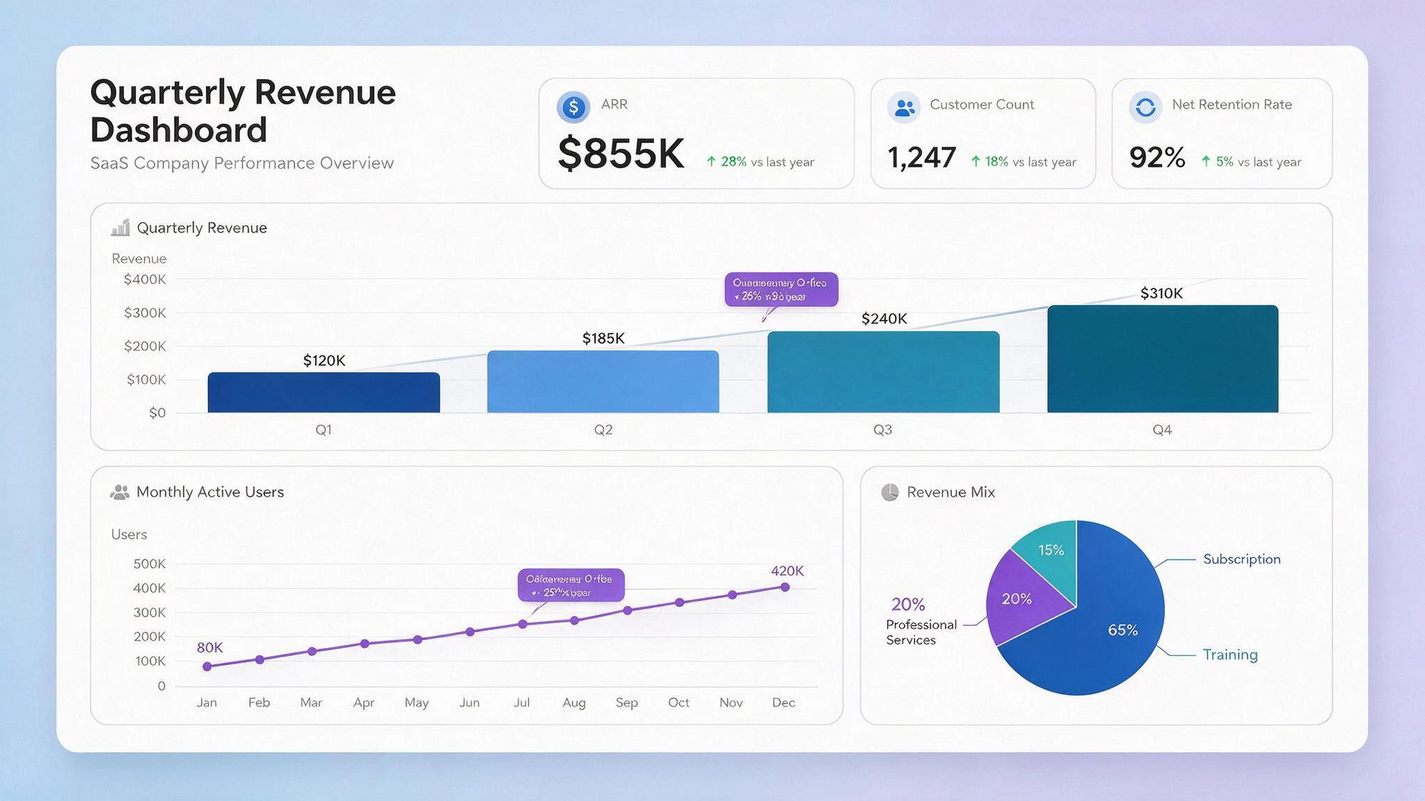
The chart data matched the prompt exactly. The bar chart renders Q1 through Q4 in the correct ascending order ($120K, $185K, $240K, $310K) with proportional heights. The line chart tracks monthly active users from 80K to 420K with the endpoint labeled. The pie chart shows the revenue split with accurate slice proportions (subscription 65%, professional services 20%, training 15%). No invented chart values, no misread proportions.
One important caveat: the three KPI cards (ARR $855K +28%, customers 1,247 +18%, net retention 92% +5%) show plausible values, but the prompt specified only the KPI labels (ARR, customer count, net retention rate) without giving their numbers, so these card values were generated by the model, not drawn from the prompt. ByteDance's "accurate data" promise held up for the chart data the prompt specified; the KPI card values are model-generated filler you should replace with your real numbers before publishing. This is a useful pattern to know: Pro renders the data you give it faithfully, and invents plausible data for the slots you leave open.
Test 2: Small Text Rendering
ByteDance promises "error-free dense text." We tested with a Winter Sale poster packed with fine print:
Generate a Winter Sale poster. Include: main title 'WINTER SALE' (large bold), subtitle 'Up to 50% Off Everything', event dates 'Dec 24–31, 2026', discount fine print 'Excludes clearance items. Cannot be combined with other offers.', four products with original and sale prices (Knit Sweater $80→$40, Down Jacket $240→$120, Boots $160→$80, Scarf $50→$25), and a store address and URL at the bottom. Retro scroll style, all English spelling correct, small text legible.

At normal density, Pro's text rendering is accurate. The main title, subtitle, event dates, and the exclusion clause ("Excludes clearance items. Cannot be combined with other offers.") all render correctly. The four product prices (Knit Sweater $80→$40, Down Jacket $240→$120, Boots $160→$80, Scarf $50→$25) are all correct, and the store address and URL are legible. No garbled characters, no misspellings in this run.
The caveat is edge cases. Independent tester @eddiboi reported on July 8 that Pro's text rendering "doesn't seem to be as good" as GPT Image 2, and our inspection of Pro's official samples agrees: in very small or very dense fine print, Pro's breakage rate runs higher than GPT Image 2. We did not run a controlled side-by-side in this article, but independent reports and our visual inspection suggest GPT Image 2 may still be stronger for extreme fine print. Pro is usable for normal fine print; treat the "error-free dense text" claim as qualified for very dense layouts. A controlled head-to-head belongs in a dedicated comparison.
Test 3: Layout and Multi-Element Structure
The third claim is "rational layout," and this is where Pro looks strongest. We prompted it with an astronomy explainer:
Generate an astronomy explainer infographic on 'why is the moon red during a total lunar eclipse'. Include: a title and one-line intro; a 3-step diagram (sunlight passing Earth, atmosphere scattering blue light, red light refracting onto the moon), each step with a small visual and caption; a Sun-Earth-Moon position schematic; a key-fact box ('longest total lunar eclipse: ~104 minutes'); a bottom knowledge tip. Clean palette, grid layout, all elements labeled and in their own zone.
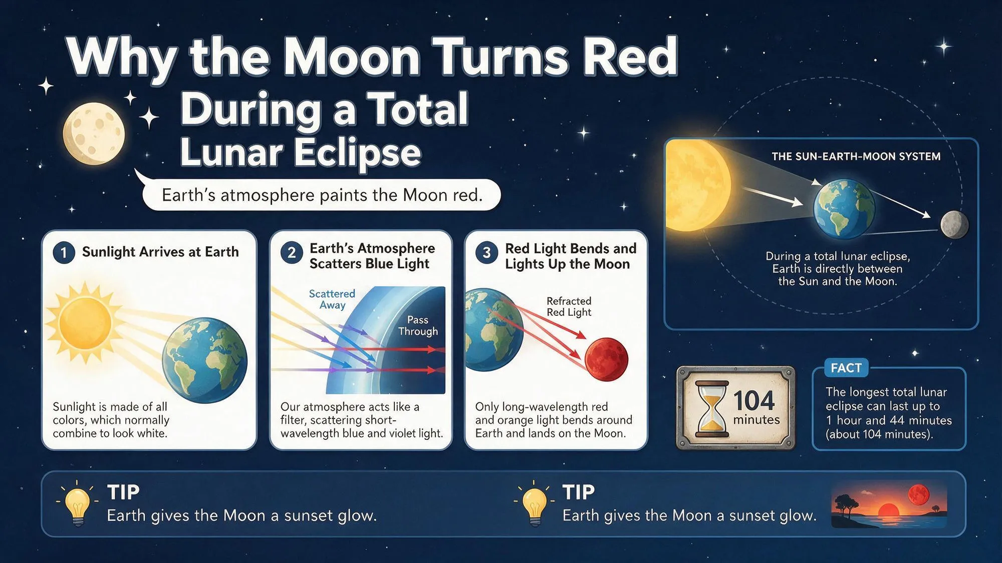
All five required elements are present: a title and intro, a 3-step diagram (sunlight arriving, atmosphere scattering blue light, red light bending onto the moon), a Sun-Earth-Moon position schematic, a key-fact box (the prompt's "longest total lunar eclipse: ~104 minutes," a commonly cited approximate figure), and a bottom knowledge tip. The layout is grid-based, with no overlapping or misaligned elements, and the 3-step diagram's visuals match their captions (the "Scattered Away" and "Pass Through" arrows correspond to the blue-light-scattering and red-light-passing descriptions). The hierarchy reads top-to-bottom, main-to-supporting.
One minor flaw: the two bottom TIP boxes contain identical text ("Earth gives the Moon a sunset glow"), a redundancy rather than a rendering error. Pro uses deep-reasoning generation, processing the prompt step by step before rendering (per the official Dreamina page). We did not isolate whether this causes the multi-zone composition to hold together, but the structural result was clean.
Test 4: Multilingual Infographics
We tested Pro's native multilingual claim with a four-language subway safety notice:
Generate a subway safety notice infographic with four languages in parallel: English, Chinese, Japanese, Korean. Include: a multilingual title ('Subway Safety / 地铁安全须知 / 地下鉄安全 / 지하철 안전'); three safety rules (don't lean on doors, let passengers off first, mind the gap), each rendered in all four languages; an emergency-call footer with an icon. All four languages accurate, neatly aligned.
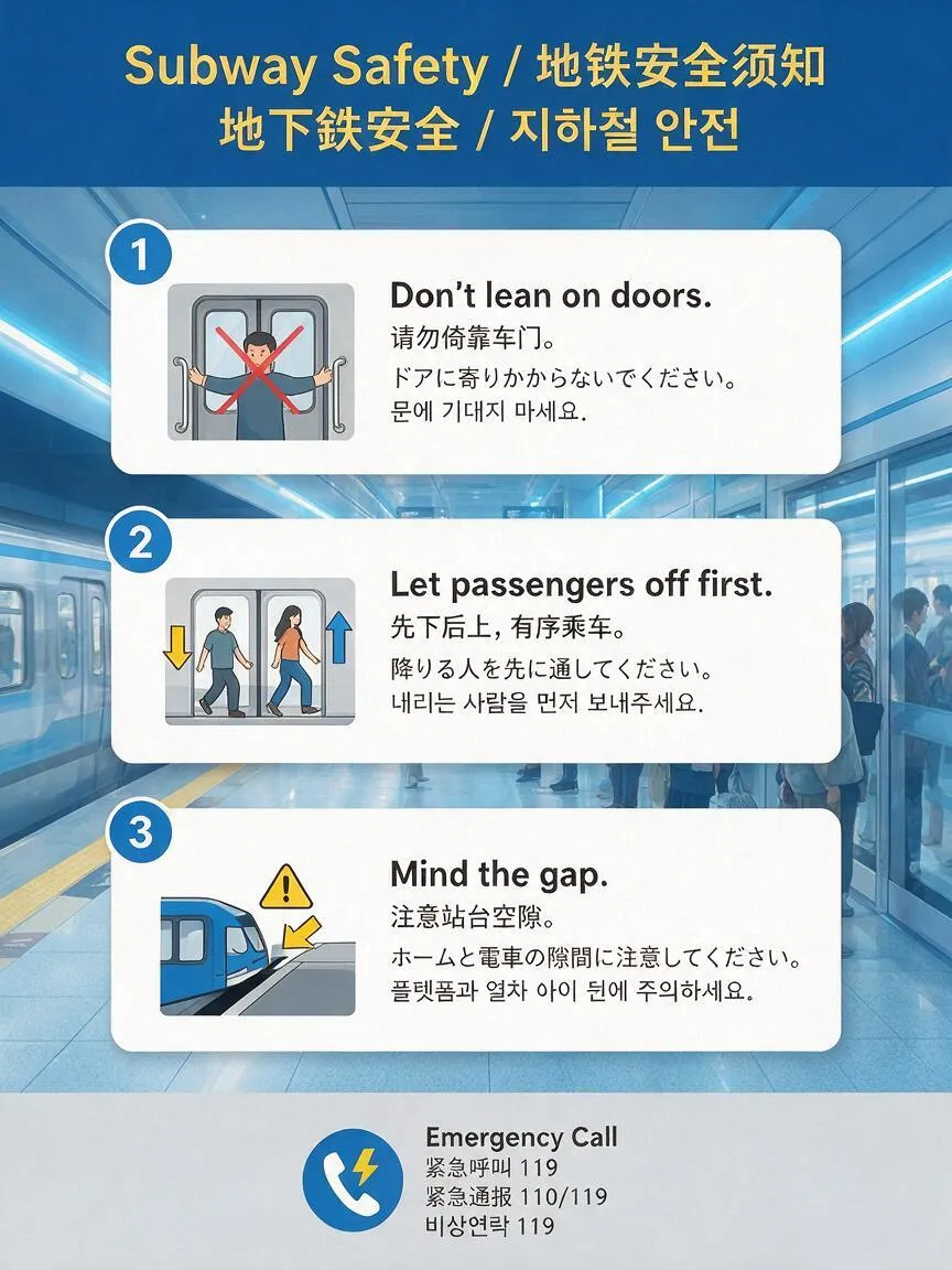
The four languages, English, Chinese, Japanese, Korean, render cleanly with no garbled characters (visually clean; not native-speaker verified). The three safety rules (don't lean on doors, let passengers off first, mind the gap) appear in all four languages, and the Japanese and Korean fine print (for example ドアに寄りかからないでください and 내리는 사람을 먼저 보내주세요) is legible. This matches @RidiTechAI's July 8 report (quoting BytePlus) of "one prompt, one poster, FOUR languages, all correct." The multilingual claim holds up visually in our test; verify translation correctness with a native speaker before publishing localized creatives.
The related feature, layer separation for localization ("swap the text layer, keep the art," per @tysyrrr on July 8), could turn one generation into four localized versions without redrawing the visuals. We will test the layer-swap once the editing API is callable at scale.
Who Should Use Seedream 5.0 Pro for Infographics
Use Pro for: data dashboards where you control the prompt's numbers (replace any model-generated KPI filler first), science and education explainers with distinct zones, multilingual posters that need one generation instead of four, and any infographic where a photographic or illustrated style matters more than editability.
Skip Pro for: extreme small-print-density designs where GPT Image 2 is the stronger pick, and time-sensitive batch workflows. Pro takes roughly 2-3 minutes per image in our Jimeng runs; we did not benchmark it against GPT Image 2 or Nano Banana Pro under identical conditions, but it felt slower in informal use. Factor this in for volume.
Pro is a text-to-image model, not a template-driven infographic tool like Venngage or Canva. Its output is pixels, not editable fields, which is a strength for visual richness and a limitation for post-generation editing. If you need accurate, editable, brand-locked charts for a business deck, a dedicated tool is still the safer call.
If you want to try Pro without a separate Volcano Engine or Byteplus account, AIReiter relays the Seedream family — including 5.0 Pro — from one endpoint, same model, one key. For prompting basics on the cheaper tier, see our Seedream 5.0 Lite prompting guide.
FAQ
Can Seedream 5.0 Pro generate infographics?
Yes. In our single-run tests it rendered accurate chart data, clean multi-element layouts, and legible four-language text in a single generation.
Can Seedream 5.0 Pro generate charts from exact numbers?
Yes, for values you specify. In the dashboard test we pinned exact chart values (Q1 $120K through Q4 $310K, a 65/20/15 revenue split, 80K to 420K monthly active users), and the rendered bar, line, and pie charts matched the input proportions. Values you leave unspecified, like KPI card numbers, the model invents plausibly, so replace them before publishing. See Test 1.
Are Seedream 5.0 Pro infographics editable?
Not as raster output. Pro generates pixels, not editable fields. The layer-separation feature, which claims to split an image into independent layers for post-generation editing, requires the editing API, which was not open at test time.
Is Seedream 5.0 Pro good at text rendering?
For normal-density text, yes. Our Winter Sale poster rendered with correct spelling and legible fine print. For extreme small-print density, we did not run a controlled side-by-side, but independent reports and our visual inspection suggest GPT Image 2 may still be stronger.
How fast is Seedream 5.0 Pro?
Roughly 2-3 minutes per image in our Jimeng runs, sampled informally and not benchmarked against other models under identical conditions. It felt slower than GPT Image 2 and Nano Banana Pro in informal use. Factor it in for batch workflows.
How do I use Seedream 5.0 Pro for infographics?
Open Dreamina, Jimeng, or the Doubao app, select Seedream 5.0 Pro, and describe the data, chart types, and layout zones explicitly (see the four test prompts above). For API access, model IDs and endpoints are in our Seedream 5.0 Pro preview.
Is Seedream 5.0 Pro free?
On Dreamina, each account gets free daily credits (verify current limits on the official page). API access is priced per image on Volcano Engine and Byteplus; see the preview for current pricing status.